
Big Dreams?
We’ve Got Space for That.
Over 40,000 Square Feet Retail, Flex, or Micro
Warehouse Commercial Space
Step into the future of East San Antonio with The Andy, a space where the city's boldest innovators, entrepreneurs, and creators come together to live, work, and grow. Once the heart of Handy Andy Grocery, this industrial-chic property has been reimagined into sleek live/work lofts, retail, flex, and micro-warehouse spaces designed for the people who make things happen.
Live/Work Lofts
For those who blur the lines between life and work, our 2, 3, and 4-bedroom live/work lofts offer the ultimate flexibility. Whether you’re a new business starting out, an established brand expanding into a new market, or an entrepreneur who needs both office space and a place to crash, these units are perfect. Use it as an office, a residence, or a hybrid of both—work downstairs, live upstairs, and maximize your time and productivity. This is a space for the doers, the thinkers, and those who are building the future.
Retail & Flex Space
Looking to scale your business? The Andy offers 40,000 +/- SF of retail and flex space, with individual units ranging from 1,260 +/- SF to 5,000 +/- SF. For larger tenants, the spaces can be combined to create up to 33,000 +/- SF, with competitive base rents starting at $13.25/SF annually. Ideal for retail, creative spaces, or offices looking for room to grow in a high-traffic, high-visibility location.
Micro-Storage Units
Supporting the rise of e-commerce and creative industries, The Andy provides micro-warehouse storage options ranging from 416 +/- SF to 1,362 +/- SF. Equipped with 18-wheeler loading docks, these spaces allow you to handle overflow inventory, run operations, and manage distribution seamlessly, all while staying close to your live/work loft or retail space.
This is your chance to be part of East San Antonio’s renaissance, where innovation meets opportunity. Spaces are limited, and they’re going fast.
.responsive-iframe-container {
position: relative;
width: 100%;
max-width: 100%; /* Full width on mobile */
height: 0;
padding-bottom: 56.25%; /* Aspect ratio for 16:9 */
margin: 0 auto;
}
.responsive-iframe-container iframe {
position: absolute;
top: 0;
left: 0;
width: 100%;
height: 100%;
}
/* For mobile devices */
@media (max-width: 768px) {
.responsive-iframe-container {
width: 100%;
padding-bottom: 56.25%; /* Aspect ratio still applies */
}
.responsive-iframe-container iframe {
height: auto; /* Let the height adjust based on the width */
}
}
/* For larger screens (Desktop or larger tablets) */
@media (min-width: 769px) {
.responsive-iframe-container {
max-width: 100%;
padding-bottom: 56.25%; /* Aspect ratio still applies */
}
.responsive-iframe-container iframe {
max-width: 100%; /* Make iframe larger on desktop */
height: 450px; /* Adjust to desired height on desktop */
}
}
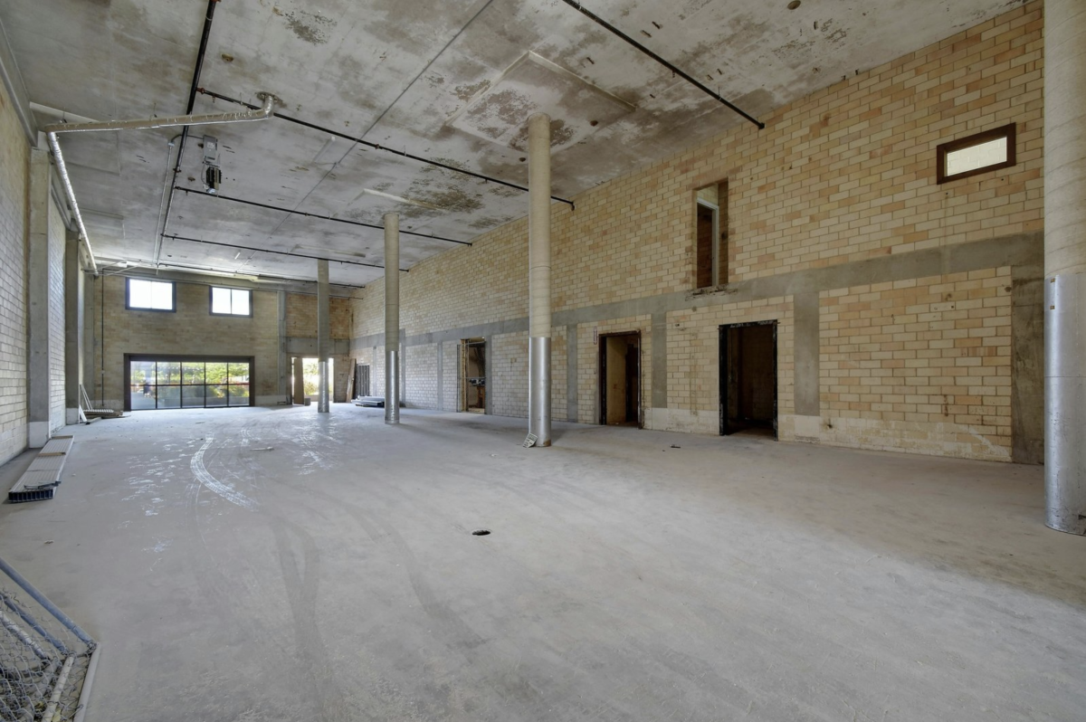
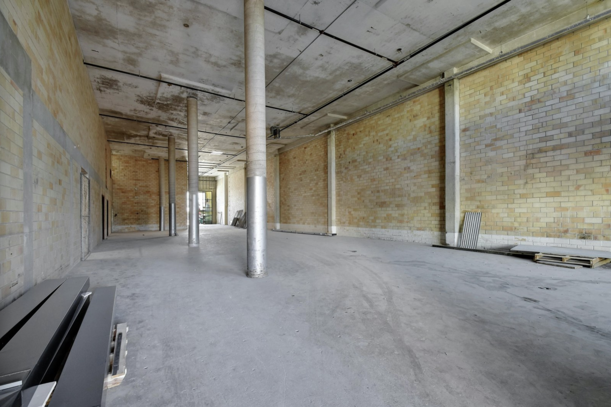

Commercial Spaces Details
Zoning: Mixed-Use
County: Bexar County
Frontage: ~550 FT on Coca Cola Place
Access: Minutes from IH-35, I-37, and I-10
3-Phase Electrical Service | 2" Water Supply | 21'+ Ceiling Height | Fully Sprinklered | Skylights | Gas Service | High Visibility | Competitive Lease Rates
County: Bexar County
Frontage: ~550 FT on Coca Cola Place
Access: Minutes from IH-35, I-37, and I-10
3-Phase Electrical Service | 2" Water Supply | 21'+ Ceiling Height | Fully Sprinklered | Skylights | Gas Service | High Visibility | Competitive Lease Rates
Contact Us
Ready to find the ideal space for your work/life goals? Contact us to be the first to hear about our community updates, specials, and more.
